Visual Composer
a guide to drag & drop page building
- created: 04/19/2015
- latest update: 05/03/2015
- by: Smartdatasoft
- email: support@smartdatasoft.com
Getting Started
Thank you for purchasing Visual Composer and congratulations with the huge win which you are going to experience once you start using our amazing page builder which will bring you new experience in building your Prestashop pages and also will save you tons of time.
This section will guide you through initial setup and activation processes in order to get your copy of Visual Composer up and running. Please follow sections step by step to get familiar with installation, activation and update processes. Moreover, as you may already know - Visual Composer works not only with your Prestashop pages, but also CMS and even custom cms types. See how you can activate Visual Composer for specific custom cms type and handle your custom CMS without any trouble.
Contents
• Module Installation
• Activation
• Update
• Content
Visual Composer
A Guide To Drag & Drop Page Building
Prestashop is great, and being able to customize your Prestashop run website is just the icing on the cake. However not all of us are coding gurus. Heck, some Prestashop lovers don’t know anything about HTML or CSS. But this shouldn’t stop you from being able to customize your Prestashop theme. This is where page builders come in.
Drag & drop page builders are widely available as modules and are built into many popular themes. They make it possible for users of all levels to make changes to the general layout of a theme, and it can make adding extra flourishes (icons, skill-bars, pricing tables, etc.) super easy. Specifically we want to introduce you to our new favorite page building Prestashop module – the Visual Composer
What Is Visual Composer
Visual Composer is a fantastic module developed by Smartdatasoft that adds a drag & drop page builder to your Prestashop theme. We popped it into our total multipurpose Prestashop theme, now we hope you can also see it in almost every new top seller on Themeforest. It gives you the tools you need to be able to create complex page layouts without needing to touch a single line of code.
How Visual Composer Works and What It Can Do
It’s a Module, so just install and activate to take advantage of all it’s wonderful features. Once activated, Visual Composer gives you control over the layout of your pages. Just add a new page, and click on the blue Backend Editor button to access the builder.

From here the possibilities are only limited by your (or your clients’) imagination. You can add rows, columns, buttons, text, images and so much more using all of the Visual Composer’s options. Plus there’s an option to save your layouts as a templates to be reused over & over again.
VC Page Builder
We are not but giving you thanks again for purchasing Visual Composer Prestashop Module. Visual Composer is very unique Module, it will help you managing your content at the Prestashop sites and create stunning layouts in few minutes without coding. Now a days many websites have complex grid layouts with columns, tabs, sliders and etc. In the past, to create that type of layouts you should be HTML guru or Shortcodes operator ninja.
But not anymore! We have prepared a short video for you to get you up and running in no time. See yourself how easy it is to create and manage complex layouts combined with professionally designed Modules made easy!
In this section you will find list of useful resources related to Visual Composer Prestashop Module, including link to official support, CodeCanyon sales page and official website.
• Resources
Resources:
• Official sales point on CodeCanyon
Official Support:
To get your support related question answered in the fastest timing, please head over to our support page and open Support ticket. To open support ticket you should have account in the ticket system. Registration should take you couple of minutes to complete and is completely automatic process. Prepare your Purchase code and fill in "Create account in Ticket system" form located at support page, then then give us your purchase code to get support. To get purchase code you can use this link for help.
Before applying for support please make sure you understand the rules of support and go through all steps described and listed in Support Policy in order to get your issues solved as soon as possible.
Module Installation
Visual Composer installation doesn't differ from any other module installation process, so you might be familiar with this process already. If not, please follow instructions below.
1. Login to your website
2. Go to Modules -> Add New Module
3. Click Upload link
4. Browse to the Module’s zip file (it is located in the archive you've downloaded from CodeCanyon) and choose that file.
5. Click "Install " button
6. Wait while module is uploaded to your server
Congratulations, you are all set! To start creating CMS Pages->Add new, Visual Composer Content Anywhere , Product Tab creator Add New and switch over to the Visual Composer mode. Also make sure to check Settings->Visual Composer for available settings
Override:
Sometime your other module will override this. That is why you may see the following message after instal Visual Composer. Don't be worry abot that you just follow our instruction. Use this link. https://www.youtube.com/watch?v=RwpxA-ANFgE

Learning More
After installing and enabling Visual Composer Module you can start creating your layouts right away. In this section you will learn all necessary skills and find valuable information for becoming an expert in Visual Composer. Soon enough you will realize(if you haven't already) that Visual Composer is amazingly easy to use and it brings your 'web design' and 'content management' skills to the brand new level.
Contents:
• Basic Concept
• Content Elements
• General Settings
• Custom CSS
• Element Design Options
• Responsive Settings
• Templates
• Predefined Layouts
Visual Composer Settings
General Settings
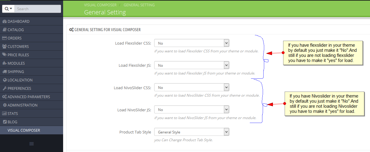
General Settings of Visual Composer can be managed in your Back-office - Settings/Visual Composer. General Settings allows editing of general configuration.
• Controlling CSS and JS Load.
• Changing Product Page Tab Style.
• You can change Image type and Image Size.
I keep referring to the Visual Composer as a page builder, but it works great with CMS and custom CMS types as well. All you have to do is enable the option. Navigate to Menu > Visual Composer. You should see a screen similar to this:

The Module will automatically display the various content types included in your Prestashop theme. Just select which you’d like to use with the Visual Composer page builder. The example above is from our Total theme, which is why there are added options for portfolio, staff and testimonials as well as forums, topics, reply and products supported by Total).
-Content From:http://www.wpexplorer.com/visual-composer-guide
VC Content Any Where
When you will want to set VC mean Visual Composer, you have to click at first Visual Composer from your dash board then have to click VC content any where.
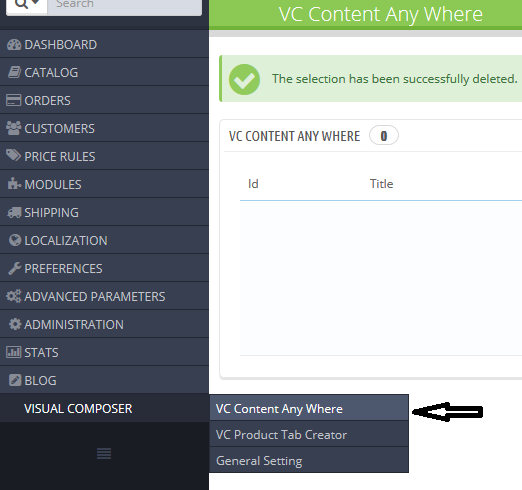
Now you have to click on import button first which on the top right side. Then Select your VC export zip file from your computer which you get as a package at the time of purchase.

Import content
Here you will find two option for import the zip file. We use to give suggetion to all that when your file size will smaller then your server max upload size, it will very easy to import by using the top option. Otherwise you have to use the next option.

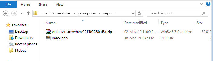
Just upload your zip file inside import folder on your jscomposer module.
After import the file you will see the following image.
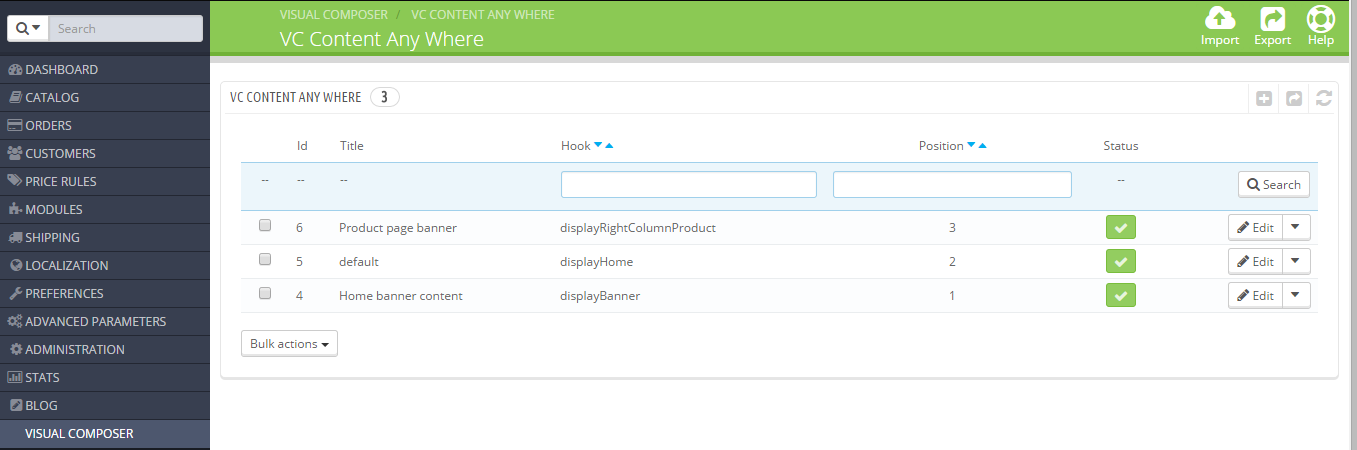
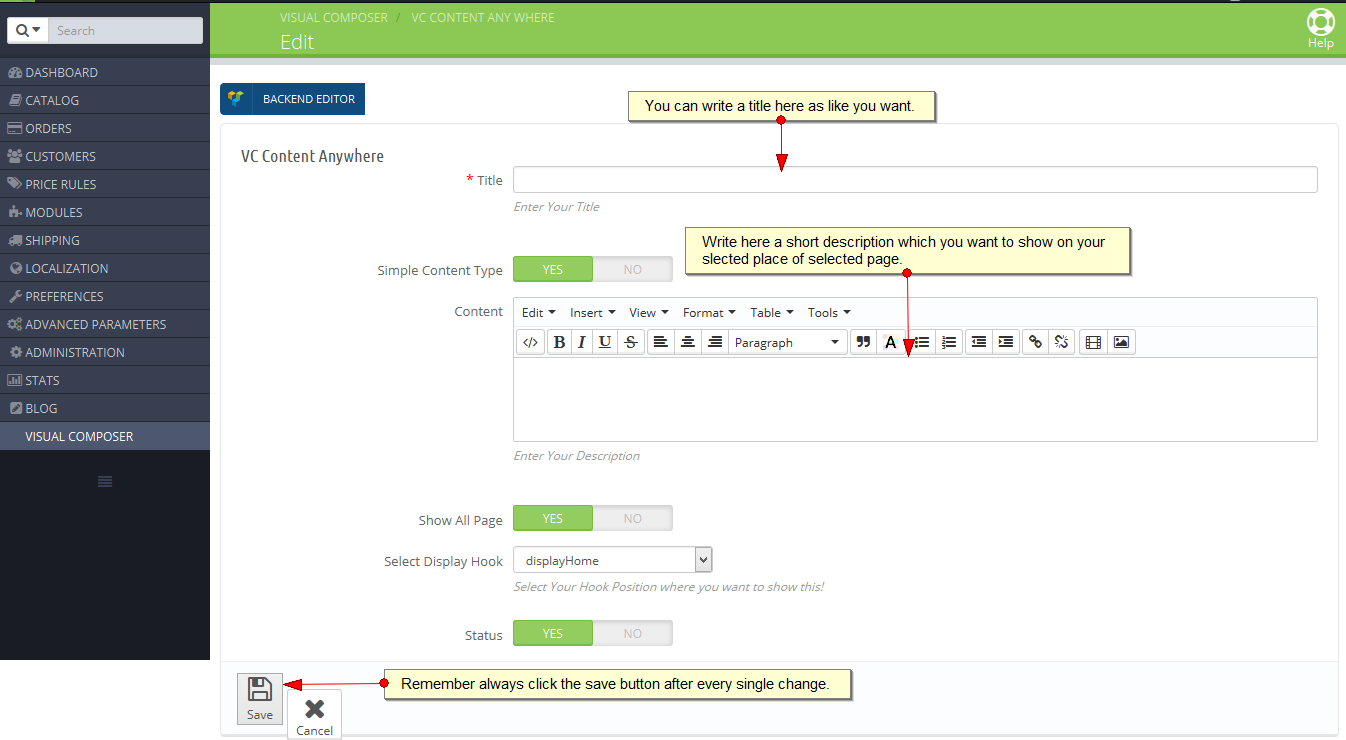
At first you have to write a title name as like you want to show in your site. Then you can write a short description.
Note: Always remember after modify or change any option you must click the save button.
Basic Usage
Exception
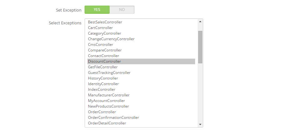
If you want to display a content only in home page display top, display footer ( which is global hook for all pages), in that case you can enable this option and select the partcular controlar which you want to exclued.
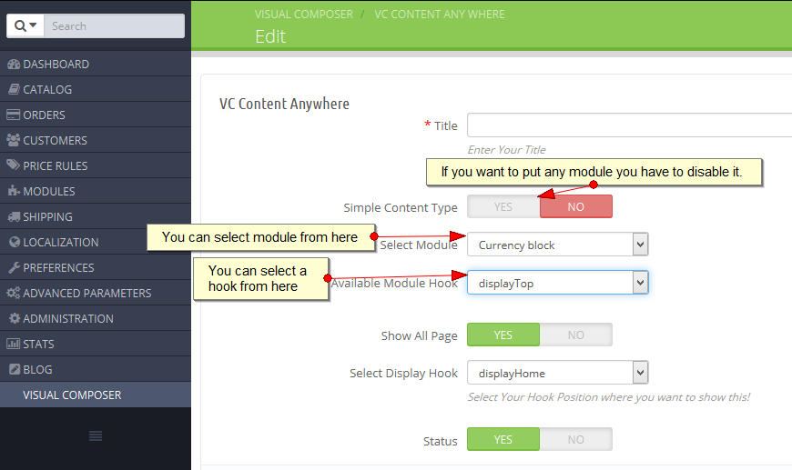
When you will want to put any module, you have to disable the "Simple Content Type". That time you will see advance module content option has come. First one is module select option where you can select module for setup module in your site. Then you have to select your hook position where you want to show.
Then you will see "Show All Page" option. When it will enable, your selected module will display all pages but when you will disable it, you will find another three option. See the following image.
Advance filter
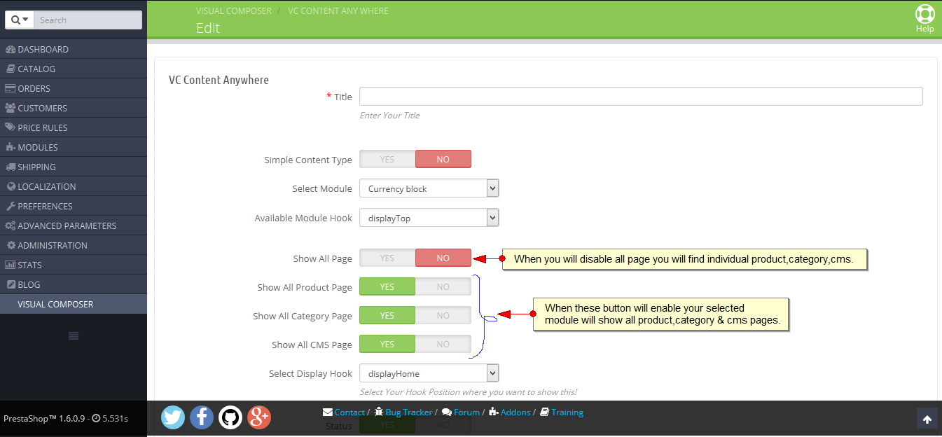
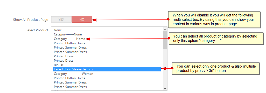
Just have a look. You got another three option after disable "Show All Page". One of those is "Show All Product Page". When it will enable, your selected module will show all product page but when you will disable it, you can see a multi select box will visible. From there you can select as category way, Single product,multiple product etc. If you want to select category product you have to select just "category----- " option. When you will want to select mutiple product you can select by press "CTRL".
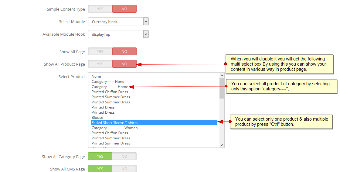
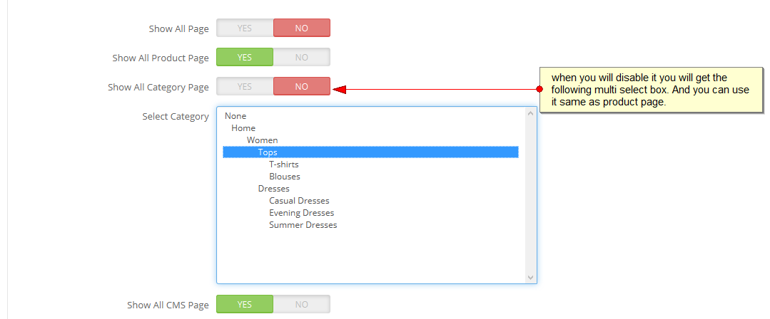
Then when you will disable category page,you will see another multi select box and you can also use it like "All product page" option.
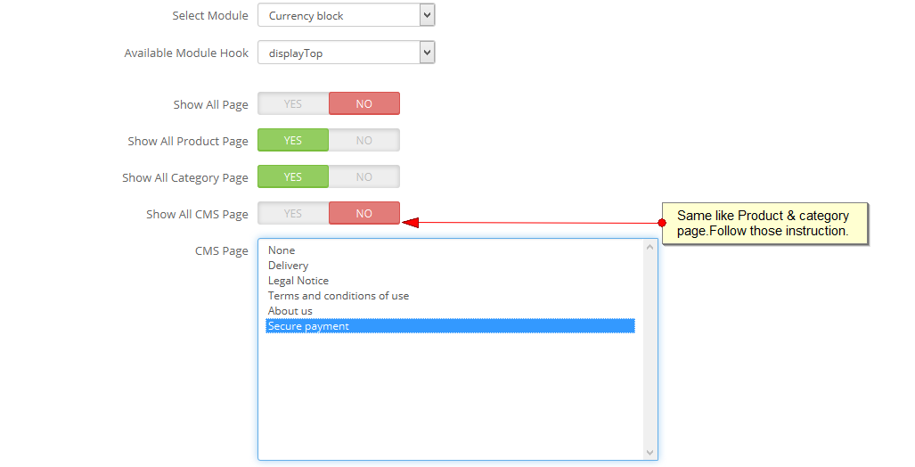
You can use "Show All CMS page" same like All Product Page. Just see the Image.
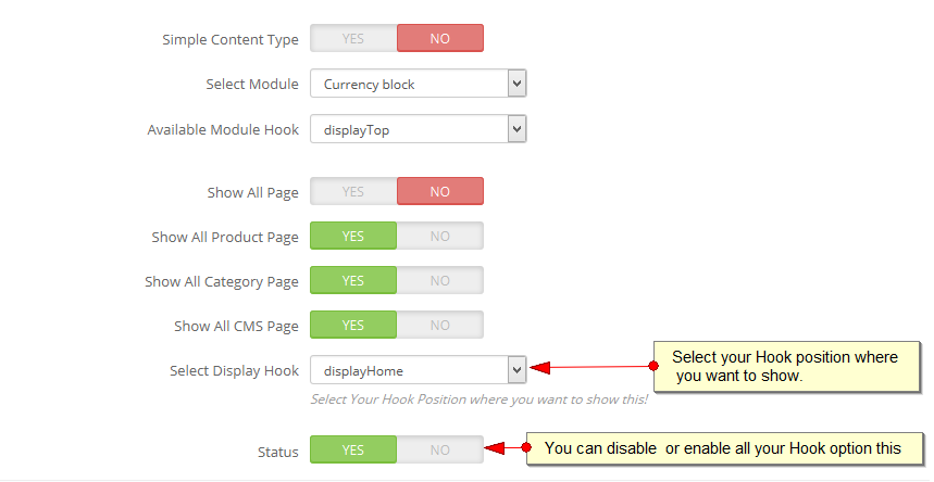
Now you have to select your hook position by using the drop down option. You can disable or enable all Hooks by using the "Status" Option which is the last option of this area.
Display Module
VC Product Tab Creator
At first you have to go Visual Composer on your dash board. Then you will see VC product Tab creator option below the VC content any where option.
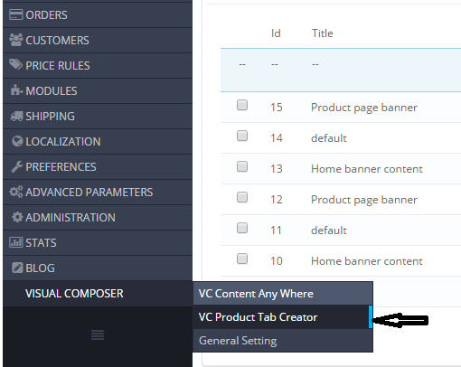
Then you will select the add option by follow the following image.
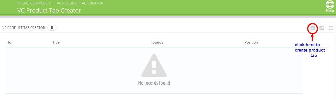
Then you will get an option like the following image.
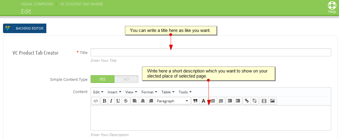
Now if you will disable the Simple content type option, you wii get the following image. By it you can select module & hook.
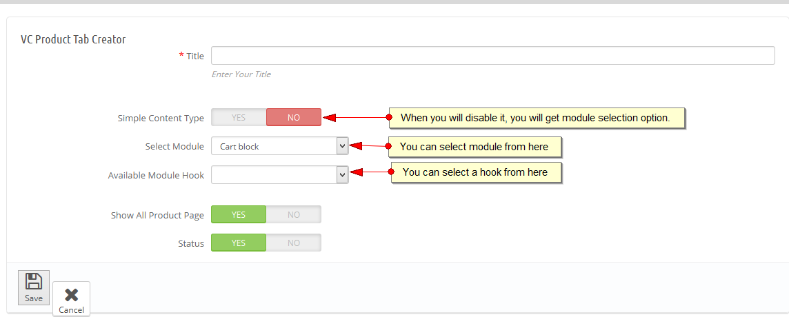
Now you can follow the instruction of the following image.
When you will see in your frontend that the content which you have made, is brocken you can resize it by the general setting. Just go to dash board>Visual Composer>General Setting>Product Tab Style.
Global Settings

General Setting for visual composer: You will get Flexslider & Nivoslider in it. You suppose to get these slider by default. But when you will not get it, you have to load both slider. When you will get it by default in your theme you will just make "NO" of CSS and js box. Otherwise you have to load it. At that time you have to make it "YES" both boxes. Remember if you do not load those slider those slider will not work.
Row Options
Included in the builder are page building elements. You can use these elements as literal building blocks for your page. First Add A Row. Rows make it possible to add columns in one click. Just hover on the yellow paragraph tab at the top left corner of your row and select a layout. The row automatically breaks into columns according to the layout you choose.
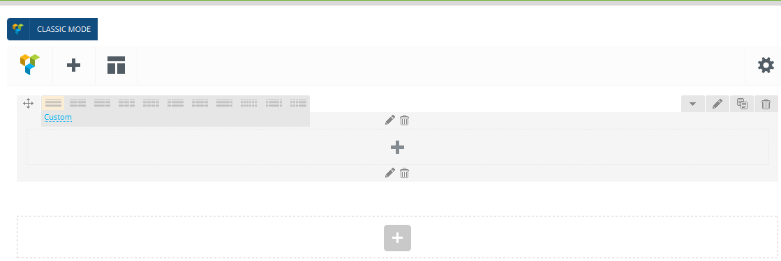
There are three added features added to the far right corner of every row. The X can be used to delete an entire row and its contents, the Papers can be used to clone or duplicate an entire row and all of its contents, and the Pencil is used to access the formatting options

Again, depending on the theme you are using with the Visual Composer the formatting options available to you may be different. While some theme developers choose to leave the Visual Composer as-is, many customize the add-on modules to fit the needs or style of their theme.
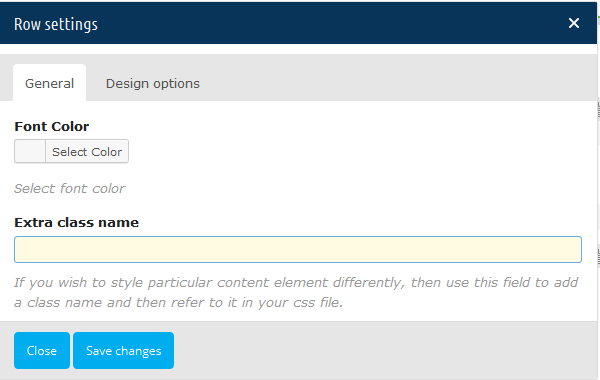

The screenshot above is from our Total Drag & Drop Prestashop theme and includes all the options we’ve custom added. We chose to separate the row styling options into tabs to make it easier for users to change the backgrounds, borders, padding and other elements of each individual row.
Page Elements
The next step is to begin adding your page features. Just click the Add Element button to open a pop-up menu. There are lots of options for adding text boxes, headings, social sharing, images and galleries, toggles or tabs, accordions, recent CMS (which also works with the custom cms types of your theme in addition to the blog CMS), buttons and even sidebar widgets.
Also, depending on the Prestashop theme and compatible modules you are using with the Visual Composer your will see more or less page elements. The above example is from our Total Drag & Drop Prestashop theme, so there are an additional 30 page builder elements we created and styled exclusively for Total. This includes custom dividers, icon boxes, milestones, carousels and more.
Click on any element to open the options for that element (which ranges from choosing colors and alignments, to make decisions about slider transitions).

Element Design Options:
Starting from version 4.1.0 Visual Composer offers additional design controls for Row, Columns, Text block, Single image and Video block which can be found under element param window 'Design Options' tab.
Within Design Options it is possible to control:
• Margins, Paddings and Border for overall element or just left, right, top or bottom part
• Border style
• Border color
• Background color
• Background image and position style.
Basic Concept:
There's one concept/design pattern you should know - in the Visual Composer editor mode you'll have "Add element" button, which you should click or drag to the working canvas, to add content block or row to your page. If you are adding row element to your page pay attention that it will automatically add column element within row. You can later add more columns within row and change their behavior. Read more about rows and columns in Elements section.
Clicking the "Add element" button will show the content element selection menu. Content blocks are divided into categories (Show all, Content, Social, Structure, Modules, etc.).
Content Elements
This is a list of 40+ available content elements that can be placed on the working canvas or inside of the columns. Think of them as bricks. With those bricks you are building your layout. Most of the content elements have options to set them click pencil icon. To save changes click save button.
Contents:
• Row
• Column
• Text Block
• Separator
• Separator with Text
• Message Box
• Facebook 'Like'
• Tweetmeme Button
• Google +
• FAQ (Toggle)
• Single Image
• Image Gallery
• Image Carousel
• Tabs
• Tour
• Accordion
• Cms Grid
• Masonry Cms Grid
• Media Grid
• Masonry Media Grid
• Cms Carousel
• Cms Slider
• Button
• Button 2.0
• Call to Action
• Call to Action 2.0
• Video Player
• Google Maps
• Raw HTML
• Raw JS
• Flickr Widget
• Progress Bar
• Pie Chart
• Empty Space
• Custom Heading
• Icon Element
• Woo Elements
• Default Display Module of PS
• 3rd Party Display Modules Support
Row
|
|
“Row“ is the main content element of Visual Composer. Rows are used to divide your page into the logic blocks with columns, columns later will hold your content blocks. Rows can be divided into the layouts (eg. 1/2 + 1/2, 1/3 + 1/3 + 1/3, and so on). Your page can have unlimited number of rows. To change row's position, click and drag row's drag handler (top left row's corner) and drag row around (vertical axis). |
|||
|
Font color |
Select font color for containing elements |
|||
|
Extra class name |
Add class name in order to refer to this element in CSS |
|||
|
Design Options |
Control borders, background and other styling options |
|||

Important: Row allows you build complex layouts by inserting inner row within root level row/column. Take into account that it is not allowed to insert inner row within inner row.
Column
“Columns“ are part of the row and they hold your content elements inside them. Columns can be reordered. Click and drag column around (horizontal axis). That way you can group elements in logical groups and then drag them around with your mouse (to re-position).
|
Font color |
Select font color for containing elements |
|
|
Extra class name |
Add class name in order to refer to this element in CSS |
|
|
Design Options |
Control borders, background and other styling options |
|
|
Width & Responsiveness |
Control width, offset and visibility of element on different devices |
|
Text Block
|
|
“Text block“ allows you to insert paragraph type text and format it using TinyMCE editor. Moreover text block allows adding media(images and videos). |
|||
|
Text |
Add/Edit content using editor TinyMCE |
|||
|
CSS animations |
Add animation to your element |
|||
|
Extra class name |
Add class name in order to refer to this element in CSS |
|||
|
Design Options |
Control borders, background and other styling options |
|||

Separator
|
|
“Separator“ add separator line to your page. |
|||
|
Color |
Choose color of your separator line, including Custom color chosen with Color picker or defined as RGB code |
|||
|
Separator alignment |
Select separator alignment. |
|||
|
Style |
Choose line styling - solid, dotted, dashed etc. |
|||
|
Border |
Border with in pixels. |
|||
|
Element width |
Define line width within column in percents |
|||
|
Extra class name |
Add class name in order to refer to this element in CSS |
|||

Separator with Text
|
|
“Separator with Text“ add separator line to your page together with text which can be positioned in the centre, left or right sides of line. |
||
|
Title |
Text which will appear on the line |
||
|
Title position |
Allows positioning of your text in the centre, left or right side of the line |
||
|
Separator alignment |
Select separator alignment. |
||
|
Color |
Choose color of your separator line, including Custom color chosen with Color picker or defined as RGB code |
||
|
Style |
Choose line styling - solid, dotted, dashed etc. |
||
|
Border |
Border with in pixels. |
||
|
Element width |
Define line width within column in percents |
||
|
Extra class name |
Add class name in order to refer to this element in CSS |
||

Message Box
|
|
“Message Box“ add noticeable message to your website in order to show success, error, warning etc. |
|||
|
Message Box Presets |
Select predefined message box designs or choose "Custom" for custom styling. |
|||
|
Style |
Select message box style. |
|||
|
Shape |
Select message box shape. |
|||
|
Color |
Select message box color. |
|||
|
Icon library |
Select icon library. |
|||
|
Icon |
Select icon from library. |
|||
|
Message text |
Add/Edit content using editor TinyMCE |
|||
|
CSS animation |
Add animation to your element. |
|||
|
Extra class name |
Add class name in order to refer to this element in CSS |
|||

Facebook 'Like'
|
|
“Facebook Like“ add social 'Like' button. |
|||
|
Button type |
Select type of your button from predefined layouts |
|||

Tweetmeme Button
|
|
“Tweetmeme button“ add social 'Tweet' button. |
|||
|
Button type |
Select type of your button from predefined layouts |
|||

Google +
|
|
“Google+ button“ add social “Google+“ button. |
|||
|
Button size |
Select size of the button |
|||
|
Annotation |
Select type of annotation presented together with button |
|||

|
|
“Pinterest“ add social 'Pinit' button. |
|||
|
Button layout |
Select type of button layout |
|||

FAQ (Toggle)
|
|
“FAQ“ add collapsible toggle to your page. |
|||
|
Toggle title |
Title of toggle which will be displayed near open/collapse button |
|||
|
Toggle content |
Content of toggle editable using editor TinyMCE |
|||
|
Style |
Toggle style. |
|||
|
Color |
Toggle icon color. |
|||
|
Size |
Toggle size. |
|||
|
Default state |
Ability to set default state of toggle open or closed(collapsed) |
|||
|
CSS animation |
Add animation to your element |
|||
|
Extra class name |
Add class name in order to refer to this element in CSS |
|||

Single Image
|
|
Add simple image to your layout and style it. Add CSS animation or apply Design Options. |
|||
|
Widget title |
Title of element which will be displayed above widget |
|||
|
Image |
Select image from media library. You can also upload images using media library |
|||
|
CSS animation |
Add animation to your element |
|||
|
Image size |
Set size of your image. Set large, small etc. or set your own width x height in pixels |
|||
|
Image alignment |
Set alignment of element within a column |
|||
|
Image style |
Set image style - choose from square, rounded, border etc. |
|||
|
Link to Large Image |
Set if you want to open large image on click |
|||
|
Image link |
Add link to your image |
|||
|
Extra class name |
Add class name in order to refer to this element in CSS |
|||

Image Gallery
|
|
Add responsive Image gallery. Choose your gallery type from Flex Slider, Nivo Slider or Image grid. |
|||
|
Widget title |
Title of element which will be displayed above widget |
|||
|
Auto rotate slides |
Select interval between auto-rotation of images or disable it |
|||
|
Images |
Select images from media library. You can also upload images using media library |
|||
|
Image size |
Set size of your image. Set large, small etc. or set your own width x height in pixels |
|||
|
On click |
Define action for onclick event if needed |
|||
|
Extra class name |
Add class name in order to refer to this element in CSS |
|||

Image Carousel
|
|
Add fixed size animated image carousel. |
|||
|
Widget title |
Title of element which will be displayed above widget |
|||
|
Auto rotate slides |
Select interval between auto-rotation of images or disable it |
|||
|
Images |
Select images from media library. You can also upload images using media library |
|||
|
Image size |
Set size of your image. Set large, small etc. or set your own width x height in pixels |
|||
|
On click |
Define action for onclick event if needed |
|||
|
Slider mode |
Slides will be positioned horizontally (for horizontal swipes) or vertically (for vertical swipes) |
|||
|
Slider speed |
Duration of animation between slides (in ms) |
|||
|
Slides per view |
Set numbers of slides you want to display at the same time on slider's container for carousel mode. Supports also "auto" value, in this case it will fit slides depending on container's width. "auto" mode isn't compatible with loop mode |
|||
|
Slider autoplay |
Enables autoplay mode |
|||
|
Hide pagination control |
If YES pagination control will be removed |
|||
|
Hide prev/next buttons |
If YES prev/next control will be removed |
|||
|
Partial view |
If YES part of the next slide will be visible on the right side |
|||
|
Slider loop |
Enables loop mode |
|||
|
Extra class name |
Add class name in order to refer to this element in CSS |
|||

Tabs

|
|
“Tabs“ is a complex element which consists of inner section collections(tabs) and its structure is similar to row and column hierarchy. You can create as many inner sections within element as you wish and then place any type of content within. Tabs and tab element has different parameters to operate with. |
Tabs Parameters
|
Widget title |
Title of element which will be displayed above widget |
|
|
Auto rotate tabs |
Auto rotate tabs each X seconds |
|
|
Extra class name |
Add class name in order to refer to this element in CSS |
|
Tab Parameters
|
Title |
Title of tab which will be displayed in Tab header |
|
|
Tab ID |
unique tab id which can be used within link (can not be modified) |
|
Important: Tabs are considered as complex elements which do not allow to insert other complex elements within.
Tour

|
|
“Tour“ is a complex element which consists of inner sections(tabs) collection and its structure is similar to row and column hierarchy. You can create as many inner sections within element as you wish and then place any type of content within. Tour and inner tab element has different parameters to operate with. |
Tour Parameters
|
Widget title |
Title of element which will be displayed above widget |
|
|
Auto rotate tabs |
Auto rotate tabs each X seconds |
|
|
Extra class name |
Add class name in order to refer to this element in CSS |
|
Tab Parameters
|
Title |
Title of tab which will be displayed in Tab header |
|
|
Tab ID |
unique tab id which can be used within link (can not be modified) |
|
Important: Tour are considered as complex elements which do not allow to insert other complex elements within.
Accordion

|
|
“Accordion“ is a complex element which consists of inner sections collection and its structure is similar to row and column hierarchy. You can create as many inner sections within element as you wish and then place any type of content within. Accordion and inner section element has different parameters to operate with. |
Tour Parameters
|
Widget title |
Title of element which will be displayed above widget |
|
|
Active section |
Enter section number to be active on load or enter false to collapse all sections |
|
|
Allow collapsible all |
Select to allow all sections to be collapsible |
|
|
Extra class name |
Add class name in order to refer to this element in CSS |
|
Tab Parameters
|
Title |
Title of section which will be displayed in Section header |
|
Important: Accordion are considered as complex elements which do not allow to insert other complex elements within.
SINCE 4.4
Grid
|
|
Add CMS of your Prestashop site in grid view. Choose CMS type, build your own unique query and define what kind of information to display. |
|||
|
Data source |
General |
Select content type for your grid. |
||
|
Narrow data source |
General |
Enter categories, tags or custom taxonomies. |
||
|
Total items |
General |
Set max limit for items in grid or enter -1 to display all (limited to 1000). |
||
|
Display Style |
General |
Select display style for grid. |
||
|
Show filter |
General |
Append filter to grid. |
||
|
Grid elements per row |
General |
Select number of single grid elements per row. |
||
|
Gap |
General |
Select gap between grid elements. |
||
|
Include only |
General |
Add CMS, pages, etc. by title. |
||
|
Custom query |
General |
Build custom query according to Prestashop Codex. |
||
|
Items per page |
General |
Number of items to show per page. |
||
|
Order by |
Data settings |
Select order type. If "Meta value" or "Meta value Number" is chosen then meta key is required. |
||
|
Sorting |
Data settings |
Select sorting order. |
||
|
Offset |
Data settings |
Number of grid elements to displace or pass over. |
||
|
Exclude |
Data settings |
Exclude CMS, pages, etc. by title. |
||
|
Grid element template |
Item design |
Select predefined grid element template. |
||
|
Filter by |
Filter |
Select filter source. |
||
|
Style |
Filter |
Select filter display style. |
||
|
Alignment |
Filter |
Select filter alignment. |
||
|
Color |
Filter |
Select filter color. |
||
|
Filter size |
Filter |
Select filter size. |
||
|
Button style |
Load more button |
Select button style. |
||
|
Button color |
Load more button |
Select button color. |
||
|
Button size |
Load more button |
Select button size. |
||
|
Arrows design |
Pagination |
Select design for arrows. |
||
|
Arrows position |
Pagination |
Arrows will be displayed inside or outside grid. |
||
|
Arrows color |
Pagination |
Select color for arrows. |
||
|
Pagination style |
Pagination |
Select pagination style. |
||
|
Pagination color |
Pagination |
Select pagination color. |
||
|
Loop pages? |
Pagination |
Allow items to be repeated in infinite loop (carousel). |
||
|
Autoplay delay |
Pagination |
Enter value in seconds. Set -1 to disable autoplay. |
||
|
Animation In |
Pagination |
Select "animation in" for page transition. |
||
|
Animation Out |
Pagination |
Select "animation out" for page transition. |
||

SINCE 4.4
Masonry Grid
|
|
Add CMS of your Prestashop site in masonry grid view. Choose CMS type, build your own unique query and define what kind of information to display. |
|||
|
Data source |
General |
Select content type for your grid. |
||
|
Narrow data source |
General |
Enter categories, tags or custom taxonomies. |
||
|
Total items |
General |
Set max limit for items in grid or enter -1 to display all (limited to 1000). |
||
|
Display Style |
General |
Select display style for grid. |
||
|
Show filter |
General |
Append filter to grid. |
||
|
Grid elements per row |
General |
Select number of single grid elements per row. |
||
|
Gap |
General |
Select gap between grid elements. |
||
|
Include only |
General |
Add CMS, pages, etc. by title. |
||
|
Custom query |
General |
Build custom query according to Prestashop Forum and Documentation. |
||
|
Items per page |
General |
Number of items to show per page. |
||
|
Order by |
Data settings |
Select order type. If "Meta value" or "Meta value Number" is chosen then meta key is required. |
||
|
Sorting |
Data settings |
Select sorting order. |
||
|
Offset |
Data settings |
Number of grid elements to displace or pass over. |
||
|
Exclude |
Data settings |
Exclude CMS, pages, etc. by title. |
||
|
Grid element template |
Item design |
Select predefined grid element template. |
||
|
Filter by |
Filter |
Select filter source. |
||
|
Style |
Filter |
Select filter display style. |
||
|
Alignment |
Filter |
Select filter alignment. |
||
|
Color |
Filter |
Select filter color. |
||
|
Filter size |
Filter |
Select filter size. |
||
|
Button style |
Load more button |
Select button style. |
||
|
Button color |
Load more button |
Select button color. |
||
|
Button size |
Load more button |
Select button size. |
||

SINCE 4.4
Media Grid
|
|
Add media from Media library to your Prestashop site in grid view. |
||||
|
Images |
General |
Select images from media library. |
|||
|
Display Style |
General |
Select display style for grid. |
|||
|
Show filter |
General |
Append filter to grid. |
|||
|
Grid elements per row |
General |
Select number of single grid elements per row. |
|||
|
Gap |
General |
Select gap between grid elements. |
|||
|
Include only |
General |
Add CMS, pages, etc. by title. |
|||
|
Custom query |
General |
Build custom query according to Prestashop Forum and Documentation. |
|||
|
Items per page |
General |
Number of items to show per page. |
|||
|
Grid element template |
Item design |
Select predefined grid element template. |
|||
|
Filter by |
Filter |
Select filter source. |
|||
|
Style |
Filter |
Select filter display style. |
|||
|
Alignment |
Filter |
Select filter alignment. |
|||
|
Color |
Filter |
Select filter color. |
|||
|
Filter size |
Filter |
Select filter size. |
|||
|
Button style |
Load more button |
Select button style. |
|||
|
Button color |
Load more button |
Select button color. |
|||
|
Button size |
Load more button |
Select button size. |
|||
|
Arrows design |
Pagination |
Select design for arrows. |
|||
|
Arrows position |
Pagination |
Arrows will be displayed inside or outside grid. |
|||
|
Arrows color |
Pagination |
Select color for arrows. |
|||
|
Pagination style |
Pagination |
Select pagination style. |
|||
|
Pagination color |
Pagination |
Select pagination color. |
|||
|
Loop pages? |
Pagination |
Allow items to be repeated in infinite loop (carousel). |
|||
|
Autoplay delay |
Pagination |
Enter value in seconds. Set -1 to disable autoplay. |
|||
|
Animation In |
Pagination |
Select "animation in" for page transition. |
|||
|
Animation Out |
Pagination |
Select "animation out" for page transition. |
|||

SINCE 4.4
Masonry Media Grid
|
|
Add media from Media library to your Prestashop site in masonry grid view. |
||||
|
Images |
General |
Select images from media library. |
|||
|
Display Style |
General |
Select display style for grid. |
|||
|
Show filter |
General |
Append filter to grid. |
|||
|
Grid elements per row |
General |
Select number of single grid elements per row. |
|||
|
Gap |
General |
Select gap between grid elements. |
|||
|
Include only |
General |
Add CMS, pages, etc. by title. |
|||
|
Custom query |
General |
Build custom query according to Prestashop Forum and Documentation . |
|||
|
Items per page |
General |
Number of items to show per page. |
|||
|
Grid element template |
Item design |
Select predefined grid element template. |
|||
|
Filter by |
Filter |
Select filter source. |
|||
|
Style |
Filter |
Select filter display style. |
|||
|
Alignment |
Filter |
Select filter alignment. |
|||
|
Color |
Filter |
Select filter color. |
|||
|
Filter size |
Filter |
Select filter size. |
|||
|
Button style |
Load more button |
Select button style. |
|||
|
Button color |
Load more button |
Select button color. |
|||
|
Button size |
Load more button |
Select button size. |
|||

Carousel

|
|
|
Add CMS of your Prestashop site in carousel view. Choose CMS type, build your own unique query and define what kind of information to display. Important: do not place CMS carrousel element within same type of CMS. Such option will trigger infinite loop. |
Slider

|
|
Create slider from your Prestashop site CMS, pages or custom CMS. Display featured images and take full control over their settings and styling. |
Button
|
|
Add button with or without icon to your layout. Control size, link and text of the button. |
|||
|
Text on the button |
Text which will appear on the button |
|||
|
URL (Link) |
Button link |
|||
|
Color |
Color of the button |
|||
|
Icon |
Set icon which you want to display on button. Icon is not mandatory and by default field value is 'None' |
|||
|
Size |
Choose one of the predefined sizes for your button |
|||
|
Extra class name |
Add class name in order to refer to this element in CSS |
|||

Button 2.0
|
|
Add button with multiple color and styling options. |
|||
|
Text on the button |
Text which will appear on the button |
|||
|
URL (Link) |
Button link |
|||
|
Button Alignment |
Select button alignment. |
|||
|
Style |
Select predefined style of the button, including square, rounded, outline, round, etc. |
|||
|
Color |
Color of the button |
|||
|
Size |
Choose one of the predefined sizes for your button |
|||
|
Extra class name |
Add class name in order to refer to this element in CSS |
|||
Call to Action
|
|
Create call to action block with text, button and control its styling. |
|||
|
Text |
Text which will appear on call to action block |
|||
|
Text on the button |
Text which will appear on the button |
|||
|
Color |
Color of the button |
|||
|
Icon |
Set icon which you want to display on button. Icon is not mandatory and by default field value is "None" |
|||
|
Size |
Choose one of the predefined sizes for your button |
|||
|
Button position |
Choose one of predefined button positions |
|||
|
CSS animation |
Add animation to your element |
|||
|
Extra class name |
Add class name in order to refer to this element in CSS |
|||

Call to Action 2.0
|
|
Create call to action block with heading, text, button and control its styling. |
|||
|
Heading first line |
Text which will appear as a heading on call to action block |
|||
|
Heading second line |
Text which will appear as a second heading on call to action block |
|||
|
CTA style |
Choose styling of call to action block from round, square, etc. |
|||
|
Element width |
Call to action element width in percents within a column |
|||
|
Text align |
Choose text align within call to action block |
|||
|
Custom Background Color |
Choose custom background color for call to action block with color picker which allow control opacity |
|||
|
Promotional text |
Add/Edit text of call to action block using editor TinyMCE |
|||
|
Text on the button |
Text which will appear on the button |
|||
|
URL (Link) |
Button link |
|||
|
Style |
Select predefined style of the button, including square, rounded, outline, round, etc. |
|||
|
Color |
Color of the button |
|||
|
Size |
Choose one of the predefined sizes for your button |
|||
|
Button position |
Choose one of predefined button positions |
|||
|
CSS animation |
Add animation to your element |
|||
|
Extra class name |
Add class name in order to refer to this element in CSS |
|||
Video Player
|
|
Insert video in your layout. Choose from multiple formats accepted by Prestashop. |
|||
|
Widget title |
Title of widget which will be displayed above widget |
|||
|
Video link |
Link to the video. More about supported formats at Prestashop Forum and Documentation. |
|||
|
CSS animation |
Add animation to your element |
|||
|
Extra class name |
Add class name in order to refer to this element in CSS |
|||
|
Design Options |
Control borders, background and other styling options |
|||

Google Maps
|
|
Insert Google Maps within your iframe. Create Google Maps using Google Map Engine and easily insert generated code within your Prestashop layout. |
|||
|
Widget title |
Title of widget which will be displayed above widget |
|||
|
Map embed iframe |
1. Visit Google maps to create your map. 2. Find location 3. Click "Share" and make sure map is public on the web 4. Click folder icon to reveal "Embed on my site" link 5. Copy iframe code and paste it |
|||
|
Map height |
Enter map height in pixels |
|||
|
Extra class name |
Add class name in order to refer to this element in CSS |
|||

Raw HTML
|
|
Insert your custom HTML content if necessary |
|||
|
Raw HTML |
Enter your HTML content |
|||

Raw JS
|
|
Insert your custom JS code if necessary |
|||
|
Raw JS |
Enter your JS code |
|||

Flickr Widget
|
|
Display your photo stream from Flickr on your Prestashop site with Flickr Widget. In order to place images you will need to determine your Flickr ID - which you can retrieve here: http://idgettr.com/ |
|||
|
Widget title |
Title of widget which will be displayed above widget |
|||
|
Flickr ID |
Enter Flickr ID |
|||
|
Number of photos |
Choose number of photos to display |
|||
|
Type |
Choose photo stream type |
|||
|
Display |
Choose photo display order |
|||
|
Extra class name |
Add class name in order to refer to this element in CSS |
|||

Progress Bar
|
|
Display progress bar with custom values. Style your whole progress bar or separate values according to your needs. |
||
|
Widget title |
Title of widget which will be displayed above widget |
||
|
Graphic values |
Development|#e75956 |
||
|
Units |
Enter measurement units (if needed) Eg. %, px, points, etc. Graph value and unit will be appended to the graph title |
||
|
Bar color |
Select bar background color |
||
|
Add Stripes? |
Add stripes to your progress bars |
||
|
Add animation? |
Add animation to stripes. Will be visible with striped bars |
||
|
Extra class name |
Add class name in order to refer to this element in CSS |
||

Pie Chart
|
|
Display pie chart with your custom value and styling parameters. |
|||
|
Widget title |
Title of widget which will be displayed above widget |
|||
|
Pie value |
Input graph value here. Choose range between 0 and 100 |
|||
|
Pie label value |
Input integer value for label. If empty "Pie value" will be used |
|||
|
Units |
Enter measurement units (if needed) Eg. %, px, points, etc. Graph value and unit will be appended to the graph title |
|||
|
Bar color |
Select pie chart color |
|||
|
Extra class name |
Add class name in order to refer to this element in CSS |
|||

SINCE 4.3
Empty Space
|
|
Insert empty space between elements with custom height. |
|||
|
Height |
Enter empty space height |
|||
|
Extra class name |
Add class name in order to refer to this element in CSS |
|||

SINCE 4.3
Custom Heading
|
|
Create custom heading with Google Fonts, choose one of predefined fonts and apply styling. Important: If you are using non-latin characters be sure to activate them under Settings/Visual Composer/General Settings. |
||
|
Text |
Enter your content |
||
|
Element tag |
Select element tag |
||
|
Text align |
Select text alignment |
||
|
Font size |
Select font size. By default the size defined by your theme for specific tag will be used |
||
|
Line height |
Select line height to set space between lines |
||
|
Text color |
Select color of your text |
||
|
Font Family |
Select Google Font family from predefined list |
||
|
Font style |
Select font styling available for chosen font family. For example light, normal, bold, italic, etc. |
||
|
Google Fonts preview |
See how you chosen Font Family and Font style looks like |
||
|
Extra class name |
Add class name in order to refer to this element in CSS |
||

SINCE 4.4
Icon Element
|
|
With Visual Composer you can easily add icons from following libraries:
|
|||
|
Icons source |
Select icon source (Library) |
|||
|
Icon |
Select icon from chosen Icon source (Library) |
|||
|
Color |
Select color of your icon |
|||
|
Background style |
Select background style for your icon (default is 'None') |
|||
|
Background color |
Select color of icon's background (only if Background style is chosen) |
|||
|
Size |
Select icon size from Mini, Small, Medium, Large, Extra Large |
|||
|
Icon alignment |
Select icon alignment |
|||
|
URL (link) |
Icon link |
|||
|
CSS animation |
Add animation to your element |
|||
|
Extra class name |
Add class name in order to refer to this element in CSS |
|||

|
Widget title |
Title of widget which will be displayed above widget |
|
|
Extra class name |
Add class name in order to refer to this element in CSS |
|
Drag & Drop
At any point in the design process you can drag & drop any row or page element to rearrange them. You can also duplicate any row or element, which makes adding repetitive content quick and easy (great for similar columns, FAQs, toggles, etc.).
Once you’ve created a design you love you can save it as a template. This comes in handy when creating a custom page layout or sidebar the you’d like to reuse. Just click on the Templates button, give your layout a name, and hit save. When you use your template it will automatically populate your page with the layout and elements you saved.
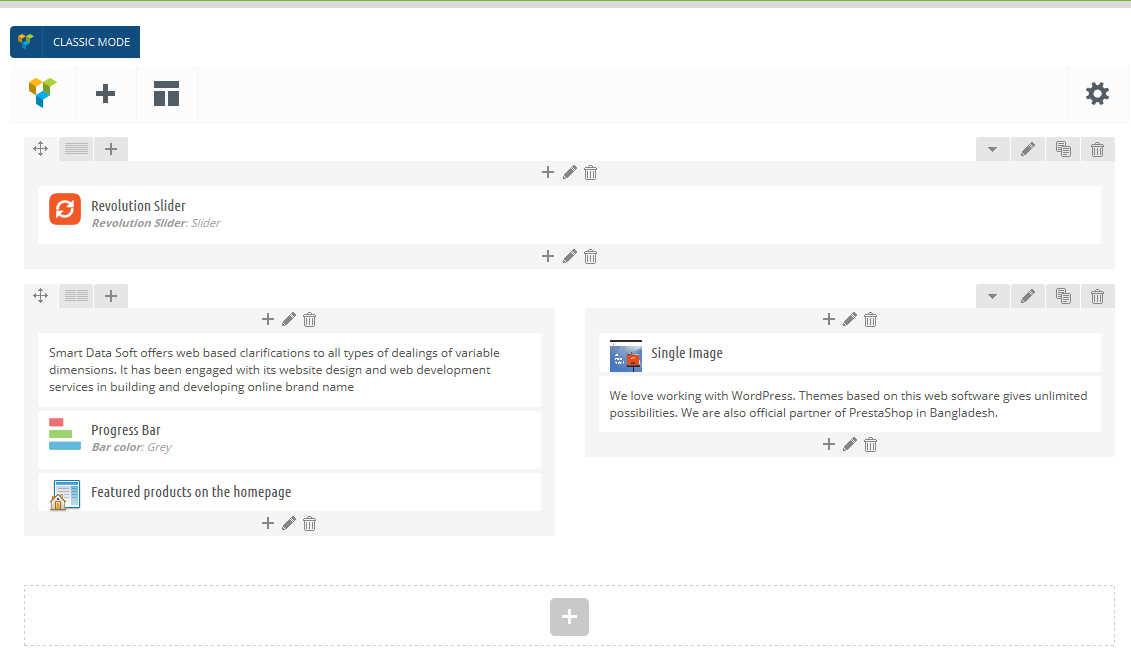
Third party modules
The builder also supports four awesome third party Modules: Revolution Slider, Smartshortcode. If you have any of these module installed, a page element will automatically appear for theme. When you choose to insert a page element for one of these modules, Visual Composer displays a drop-down of the respective sliders/forms you’ve created, or displays an entry box for you to add your slider ID. No more copying and pasting codes!
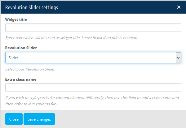
Occasionally Visual Composer is extended with support for popular third party Modules. Currently this third party
Modules are supported:
1. Revolution Slider
2. SmartShortCode
3. SmartBlog
4. Also Display all available hooks Modules
After placing content element to the working canvas (page), click pencil icon to see options available for this particular shortcode (content element).
Inner API
Methods available:
• vc_add_default_templates()
• vc_add_param()
• vc_add_params()
• vc_disable_frontend()
• vc_enabled_frontend()
• vc_is_as_theme()
• vc_is_updater_disabled()
• vc_map_update()
• vc_map()
• vc_remove_element()
• vc_remove_param()
• vc_set_as_theme()
• vc_set_shortcodes_templates_dir()
• vc_shortcodes_theme_templates_dir()
At first you have to need registered "vcBeforeInit" hook and write all inner API methods in this hook method . Otherwise inner API method do not work properly.
N.B. If any inner API do not work, Must have to check " vcBeforeInit" hooked is registered to that modules.
vc_add_default_templates()
To add more predefined templates to the Visual Composer interface call vc_add_default_templates() function in your jscomposer.php file. Predefined templates are available since Visual Composer 4.3 version.
Note: vc_add_default_templates() should be hooked in vc_load_default_templates_action action.
<?php vc_add_default_templates( $data); ?>
Params
Param Name Type Description
$data Array Information about your new predefined template
Modify default templates:
To modify default templates list you can use vc_load_default_templates hook and filter/modify array which stores default templates in it.
vc_add_param()
<?php vc_add_param( $shortcode, $attributes); ?>
Param Name Type Description
$shortcode Array Shortcode base. For [my_shortcode] shortcode base is my_shortcode. For default "Message box" element, base is "vc_message"
$attributes Array Array should be defined according to vc_map() available options.
Code explanation:
1. First we create array which "describes" new attribute that should be added to "Message box" element. Note: during the initial vc_map() function call "vc_message" was used as a base attribute, base is required to properly "target" function call
2. Then we call vc_add_param() function with new attribute and base
vc_add_params()
This helper function is similar to vc_add_param(), but it can accept multiple params that should be added to your content element. Basically this function will use a foreach loop for all the attributes and then vc_add_param() will be called for each single param. List of available parameters.
<?php vc_add_params( $shortcode, $attributes); ?>
Param Name Type Description
$shortcode String Shortcode base. For [my_shortcode] shortcode base is my_shortcode. For default "Message box" element, base is "vc_message"
$attributes Array Multidimensional array should be defined according to vc_map() available options.
vc_disable_frontend()
To disable frontend editor on your site call vc_disable_frontend() function from your functions.php file. Note: This functions is available since Visual Composer 4.0 version.
<?php

vc_disable_frontend();

?>
Params
None.
Example
How to disable frontend editing mode in Visual Composer.
<?php vc_disable_frontend(); ?>
vc_enabled_frontend()
Returns (bool) true if front end editor is enabled or (bool) false if theme author previously used vc_disable_frontend() to disabled front end editor on the site.
<?php vc_enabled_frontend(); ?>
Params
None.
Example
Check if frontend editing mode is enabled on your site.
<?php

if( vc_enabled_frontend() ) {

    // Front end editor mode is enabled. Do something.

}

?>
vc_is_as_theme()
Helper function that will return (bool) true if Visual Composer is integrated in to the theme. This is true if theme author called vc_set_as_theme() from theme's functions.php file.
<?php vc_is_as_theme(); ?>
Params
None.
Example
Check if Visual Composer is running in a "theme mode".
<?php

if( vc_is_as_theme() ) {

    //Do something

}

?>
vc_map_update()
After vc_map() function call all mapping data is stored in memory, if you need to modify one of the existing parameters you can use vc_map_update() function to do that. This is useful if you want to make a simple change to the existing content elements. For example: Change content element name.
<?php vc_map_update( $shortcode, $settings); ?>
Params
Param Name Type Description
$shortcode String Shortcode base. For [my_shortcode] shortcode base is my_shortcode. For default "Message box" element, base is "vc_message"
$settings Array Array with list of settings that should be updated for desired content element. List of settings that can be changed
Example: How to change default name and category values for "Message box" content element.
<?php

$settings= array(

  'name'=> 'new name',

  'category'=>  'New category name'

);


vc_map_update( 'vc_message', $settings); // Note: 'vc_message' was used as a base for "Message box" element

?>
vc_map_update()
After vc_map() function call all mapping data is stored in memory, if you need to modify one of the existing parameters you can use vc_map_update() function to do that. This is useful if you want to make a simple change to the existing content elements. For example: Change content element name.
<?php vc_map_update( $shortcode, $settings); ?>
Params
Param Name Type Description
$shortcode String Array with list of settings that should be updated for desired content element. List of settings that can be changed
$settings Array Array with list of settings that should be updated for desired content element. List of settings that can be changed
Example: How to change default name and category values for "Message box" content element.
<?php

$settings= array(

  'name'=>  'new name',

  'category'=>  'New category name'

);

vc_map_update( 'vc_message', $settings);

// Note: 'vc_message' was used as a base for "Message box" element

?>
vc_map()
To add your shortcode to the Visual Composer content elements list, vc_map() function should be called with an array of special attributes describing your shortcode.
<?php vc_map( $params); ?>
Contents
• Contents
• Parameters
• params Array
o Parameters of params Array
Available type values
• Param Dependencies
• Nested Content Elements
• Example
o Add existing shortcode
Parameters
$params Associative array which holds instructions for Visual Composer and is used in "mapping" process.
Param Name Type Desceiption
weight Integer Content elements with greater weight will be rendered first in "Content Elements" grid (Available from 3.7 version)
show_settings_on_create Boolean Set it to false if content element's settings page shouldn't open automatically after adding it to the stage
params Array List of shortcode attributes. Array which holds your shortcode params, these params will be editable in shortcode settings page
name String Name of your shortcode for human reading inside element list
js_view String Set custom backbone.js view controller for this content element
icon String URL or CSS class with icon image.
html_template String Path to shortcode template. This is useful if you want to reassign path of existing content elements through your module. Another way to change html markup
group String
Group your params in groups, they will be divided in tabs in the edit element window (Available from Visual Composer 4.1)
front_enqueue_js String Absolute url to javascript file (useful for storing your custom backbone.js views), this js will be loaded in the js_composer frontend edit mode (it allows you to add more functionality to your shortcode in js_composer frontend edit mode). (Available from Visual Composer 4.2.2)
front_enqueue_css String Absolute url to css file if you need to load custom css file in the frontend editing mode. (Available from Visual Composer 4.2.2)
description String Short description of your element, it will be visible in "Add element" window
custom_markup String Custom html markup for representing shortcode in visual composer editor
class String CSS class which will be added to the shortcode's content element in the page edit screen in Visual Composer backend edit mode
category String Category which best suites to describe functionality of this shortcode. Default categories: Content, Social, Structure. You can add your own category, simply enter new category title here
base String Shortcode tag. For [my_shortcode] shortcode base is my_shortcode
admin_enqueue_js String Absolute url to javascript file, this js will be loaded in the js_composer edit mode (it allows you to add more functionality to your shortcode in js_composer edit mode)
admin_enqueue_css String Absolute url to css file if you need to add custom css for element block in js_composer constructor mode
params Array
Here you should describe all you shortcode's attributes that should be editable with Visual Composer interface. Each shortcode's attribute should be described in separate array element.
Defining "Text" attribute:
array(

  "type"=> "textfield",

  "holder"=> "div",

  "class"=> "",

  "heading"=>  "Text",

  "param_name"=> "foo",

  "value"=> "This is test param for creating new project",

  "description"=> "Enter foo.",

)
Parameters of params Array
Param Name Type Desceiption
type String Attribute type. In the "Available type values" table you can see all available variations
holder String HTML tag name where Visual Composer will store attribute value in Visual Composer edit mode. Default: hidden input
params Array List of shortcode attributes. Array which holds your shortcode params, these params will be editable in shortcode settings page
class String Class name that will be added to the "holder" HTML tag. Useful if you want to target some CSS rules to specific items in the backend edit interface
js_view String Set custom backbone.js view controller for this content element
heading String Human friendly title of your param. Will be visible in shortcode's edit screen
param_name String Must be the same as your parameter name
group String
Group your params in groups, they will be divided in tabs in the edit element window (Available from Visual Composer 4.1)
value Array or String Default attribute's value
description String Human friendly description of your param. Will be visible in shortcode's edit screen
admin_label Boolean Show value of param in Visual Composer editor
dependency Array Define param visibility depending on other field value. Please read Param Dependencies
edit_field_class String Set param container width in content element edit window. According to Bootstrap logic eg. col-md-4. (Available from Visual Composer 4.0)
weight Integer Params with greater weight will be rendered first. (Available from Visual Composer 4.4)
group String Use it to divide your params within groups (tabs)
admin_enqueue_js String Absolute url to javascript file, this js will be loaded in the js_composer edit mode (it allows you to add more functionality to your shortcode in js_composer edit mode)
Available type values
There are multiple attribute types available, this field is used to "tell" Visual Composer how to handle your attribute in content element edit screen.
Value Desceiption
textarea_html Text area with default Prestashop Editor. Important: only one html textarea is permitted per shortcode and it should have "content" as a param_name
textfield Simple input field
textarea Simple textarea field
dropdown Dropdown input field with set of available options. Array containing the drop down values (either should be a normal array, or an associative array)
attach_image Single image selection
attach_images Multiple images selection
posttypes Checkboxes with available post types
colorpicker Color picker
exploded_textarea Text area, where each line will be imploded with comma (,)
widgetised_sidebars Dropdown element with set of available widget regions, that are registered in the active wp theme
textarea_raw_html Text area, its content will be coded into base64 (this allows you to store raw js or raw html code)
vc_link Link selection. Then in shortcodes html output, use $href = vc_build_link( $href ); to parse link attribute
checkbox Creates checkboxes, can have 1 or multiple checkboxes within one attribute
loop Loop builder. Lets your users to construct loop which can later be used during the shortcode's output
base Shortcode tag. For [my_shortcode] shortcode base is my_shortcode
css Basic CSS style editor for your content element. Check "Add "Design Options" Tab with CSS Editor to Your Element" page for more details)
attribute types can be extended with new custom types. Tutorial: Create new param type
Param Dependencies
It is possible to link param with another param by defining dependency param. Dependency param is array with defined param name and values which will allow to display this linked param. Also it is possible to show param field if linked field is not empty and define callback function which will be called when value of linked element is changed. Next table contains field list and explanation of dependency param array keys.
Key Name Type Desceiption
element String Param name (linked field) which will be observed for changes. Must be the same as param_name param for shortcode attribute
value Array List of linked element's values which will allow to display param
not_empty Boolean Display field if value of linked field is not empty
callback String javascript function name. Function will be called when value of linked field is changed
js_view String Set custom backbone.js view controller for this content element
icon String URL or CSS class with icon image. More info here
html_template String Path to shortcode template. This is useful if you want to reassign path of existing content elements through your module. Another way to change html markup
admin_enqueue_css String Absolute url to css file if you need to add custom css for element block in js_composer constructor mode
Nested Content Elements
If you are looking for a way to create content elements with "nested" structure, have a look at this example.
Example
In this example you will be guided throw the whole process of adding your own shortcode to the Visual Composer editor. We also prepared a nice and clean "starter" for you, feel free to use it as a starting point for your own Visual Composer shortcode.
Nested Content Elements
If you are looking for a way to create content elements with "nested" structure, have a look at this example.
vc_remove_element()
To remove content element from Visual Composer editor you should call vc_remove_element() function from your theme's jscomposer.php file with shortcode's base passed as parameter.
<?php jscomposer::vc_remove_element( $shortcode); ?>
Params
Param Name Type Description
$shortcode String Shortcode base. For [my_shortcode] shortcode base is my_shortcode. For default "Message box" element, base is "vc_message"
Example: To remove default "Message box" element from Visual Composer use this code:
<?php

vc_remove_element( "vc_message"); //Note: "vc_message" was used in the vc_map() function call as a base parameter for "Message box" element

?>
vc_remove_param()
To remove parameter from existing content element you can use vc_remove_param() function.
<?php vc_remove_param( $shortcode, $attribute_name); ?>
Params
Param Name Type Description
$shortcode String Shortcode base. For [my_shortcode] shortcode base is my_shortcode. For default "Message box" element, base is "vc_message"
$attribute_name String Parameter name (param_name) from "params" array in your vc_map function call
vc_set_as_theme()
You as a theme author may want to hide certain Visual Composer settings tabs, for example: "Design options" tab under Settings->Visual Composer page and "Hola! Please activate your copy of Visual Composer to receive automatic updates.". To do that, you should call vc_set_as_theme() function from your functions.php file.
<?php vc_set_as_theme( $disable_updater= false ); ?>
Params
Param Name Type Description
$disable_updater Boolean You can pass optional argument to disable automatic updates notifications and hide "Product License" tab in Settings->Visual Composer
vc_set_default_editor_post_types()
To enable Visual Composer page builder for theme defined post types by default, you can make use of vc_set_default_editor_post_types() api function.
<?php vc_set_default_editor_post_types( $list); ?>
Params
Param Name Type Description
$list Array List of post types for which Visual Composer should be available by default
Frontend Editor
The powerful Visual Composer now includes a frontend editor, which makes it easier than ever to get started building your own pages and layouts. The only caveat is that not all themes support the front-end editor just yet. Make sure to double check a theme’s feature list, or to contact the theme developer directly, to see if the Visual Composer frontend editor is compatible with your Prestashop theme.
Update
To update Visual Composer from older version, please follow this steps.
1. First, login to CodeCanyon and under your profile click Downloads link.
2. Re-download Visual Composer.
3. Now navigate to the Modules menu in your Prestashop back-office area.
4. Upload new version that downloaded few seconds earlier like as install new module.
Developers
Predefined Layouts:
You can select from predefined started templates and if you are a developer you can modify that list . Templates are featured at the Visual Composer welcome page and are accessible by clicking Templates button in Visual Composer top bar and then navigating to "Default templates" tab.
Extensions:
The last feature I’d like to touch on is Visual Composer’s extendibility. If you happen to be an advanced coder or theme developer you can integrate your own short codes into the module. In fact, we added in our own Simple Short codes Premium to give Total users an additional page building elements. This gives users even more options when building pages!
If you’re not a coder, checkout CodeCanyon and do a quick search for Visual Composer Add-on. There are lots of great premium Modules that add extra features to the Visual Composer
Periodically we update our "How To" section with new materials.
• Add "Design Options" Tab with CSS Editor to Your Element
• Add Custom Row Layouts (Presets)
• Change CSS Class Names in Output
• Change Shortcode's HTML Output
• Create New Param Type
• Nested Shortcodes (container)
• Param position control with vc_add_param
• Remove "Edit with Visual Composer" from Prestashop Admin Bar
• Remove Content Element from Grid Builder
• Set Content Element Icon
• Update Single Param Values
Become a VC Tester
Smartdatasoft is looking for a customers who are willing to receive latest updates of Visual Composer before official release for testing in order to help your beloved Module to be shipped in a top quality.
Contents
• Contents
• What is Happening?
• Our Requirements
• What will You Receive?
• How to Apply?
What is Happening?
Starting from Visual Composer version 4.5 we are launching "Visual Composer Tester Program" based on our customers in order to rise quality of Visual Composer Module. This is introduced as an additional mechanism for ensuring we are releasing bug free top quality product that fits with our customer real life environment. During program we will involve 4-5 candidates in our testing process and will collaborate with them on regular basis to come up with the best results possible. There are several requirements listed below which must be met in order to apply as a candidate and of course there are also bonuses for those who participate in our program.
Our Requirements
There are following mandatory requirements you must fit in order to apply:
• You must be a Visual Composer user and direct client of Smartdatasoft (you must have direct license for Visual Composer);
• You must have a valid website with content where you have Visual Composer activated;
• You must have latest Prestashop installation on your site;
• You will need to provide Smartdatasoft with site credentials in order to access your site;
• You must have at least 1 add-on for Visual Composer installed on your site.
In additional there are following optional requirements - in order to apply for tester you must fit with at least 3 out of 7 optional requirements:
• You have a Prestashop theme which was delivered with Visual Composer bundled(now in-built version is disabled or auto-update is set for this version);
• You have Visual Composer Custom CSS used on your Prestashop site;
• You have extended capabilities of Visual Composer by using Visual Composer API;
• You have ShortCodes mapped with ShortCode Mapper;
• You have additional custom predefined templates/layouts added in addition to built-in predefined templates/layouts;
• You have at least one of following modules installed: Revolution Slider, SmartBlog, SmartShortCode.
What will You Receive?
There are following bonuses that you will receive if applying to our tester program:
• You will receive latest Visual Composer versions even before they will be available on CodeCanyon for public download;
• Your credentials will be mentioned in our release credits.txt (unless you state other);
• You will participate in development process of the most popular page builder module for Prestashop.
How to Apply?
In order to apply for Visual Composer testing please send inquiry to e-mail address support@Smartdatasoft.com with reference "Visual Composer Tester". In the e-mail you must provide:
• Your name, surname;
• Envato username;
• Website address;
• Site credentials (which Smartdatasoft will use to access your site);
• List of Visual Composer add-ons used on your site;
• List of Optional requirements that applies to you.
Thank you for your interest,
Smartdatasoft Team
Release Notes
We are constantly working on a new features and improvements for Visual Composer in order to keep your site and your business at the top. In this section you can find information on each and every update we created during lifetime of Visual Composer.
• Color picker z-index increased
• Proper image gallery re-initialization after dragging
• Negative values can be saved in Design options now
• Single image now has circle and round styles
• Shortcode mapper parsing shortcodes correctly now
• Quotes (") can be used in the Custom heading element
• Row stretching works as expected now
• Position after cloning element is correct now
• Auto rotate tabs works now
• "h3 element converted to p tag if template is saved in frontend editor" fixed
• "1/3 + 2/3" layout is added in grid builder
• 3D shadow look improved for single image element
• vc_load_default_templates_action returned
• Custom query works properly in grid builder now
• Extra CSS class can be used in grid elements now
• Single image styles fixed
• added action "vc_load_default_templates_action"
• vc_add_default_templates() fixed
• Added compatibility for older Layer slider
• Background disappearing in row on child element deleting fixed
• Message box backwards compatibility added
• Grid builder ajax stability improved
• Css tpl for Design options regenerated
• Custom query in Grid builder handles correctly ampersand and quote marks
• Compatibility with jwplayer improved
Support Policy
In order to get response in reasonable time we are kindly asking you to provide following information while opening support ticket:
• Your website URL
• Login credentials
• Version of Visual Composer used
• Detailed description of actions taken before issue
• Screenshot of the problem
• Any other information that you find useful
All information provided is confidential and will not be provided to any third party.
What You Can Expect From Our Support?
There are certain things that you can expect from our Help Center:
• We always have bug-related and technical support in priority
• We are happy to receive proposals and ideas
• Tiny custom requests can be served (low priority, depending on workload and good will)
What You Can Not Expect From Our Support?
There are certain things that are out of scope and will not be handled by our team:
• Generic Prestashop questions
• Issues related to 3rd party add-on Modules
• Customization requests
• Any tickets that contain abuse or violence
• Requests from indirect purchases (Visual Composer came as part of some other product)
E-mail Policy:
With leaving your e-mail you agree to receive promotional e-mails and newsletters from Smartdatasoft.
Thank you for finding time to read this policy and remember that we are here to help you out.
Best wishes, Smartdatasoft
Licensing
This section will explain all you have to know about licensing for Visual Composer and point you to necessary resources. The most important thing you need to know about licensing of Visual Composer is that we totally rely on licensing and copyrights developed by Envato who has an amazing licensing standards. At the moment Envato, so as Smartdatasoft, offers several types of licenses.
Available Licenses
• Regular License
• Extended License
Regular License
common type of licensing for Visual Composer. Regular license allows you to use item in one single end product which end user is not charged to access or use. You can acquire regular license for your own website, or if you are a developer - for one client by transferring the license to your client when the project is finished. Important: Distribution of source files is not permitted. In order to read more about Regular license please visit CodeCanyon.
Extended License
Extended License allows use of the item in one single end product, which you or one client may sell to end users (charge end users to access or use the end product), but user do not have access to the source files in any case.
Important: Distribution of source files is not permitted.
Extended license allows you, with the permission from Smartdatasoft, to integrate Visual Composer into your Prestashop theme to sell on ThemeForest. In order to read more about Extended license please visit CodeCanyon.
Outro
Thank you for your purchase. If you have any questions that are beyond the scope of this help file, please use our Support system to open support ticket.
Arifur Rahman, Smartdatsoft
Don't be shy - join us on Facebook. Smartdatasoft website •
Content From:https://wpbakery.atlassian.net/wiki/display/VC/Visual+Composer+Pagebuilder+for+WordPress
FAQ
1. How can you use Visual Composer to fetch other modules output regarding to the display hooks instead of using the module directly in your site ?
Ans: Any one can use all of the default module and also other module by Visual Composer on his site in prestashop. At the first time you will have to install the module. Just we are giving an example with a single module. You can follow the instruction to use any module on oyur site. Just have a look.
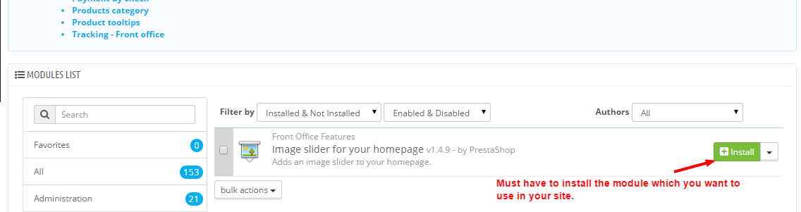
Now you will go to module>posssion> then UNHOOK the modue from module possition.
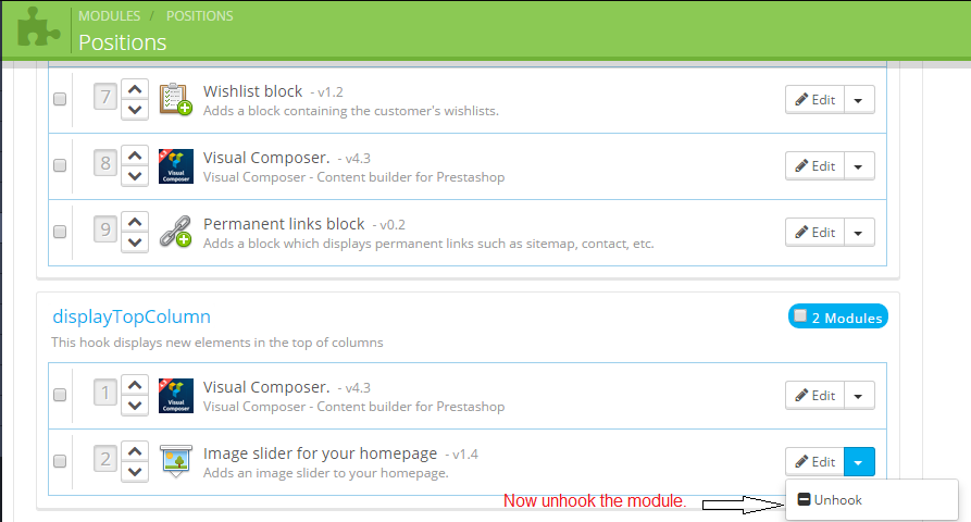
Then you have ready to use Visual Composer. Go to Visual Composer on dashboasrd>VC content any where>Click edit option of any content of your display possition>click backend editor option>
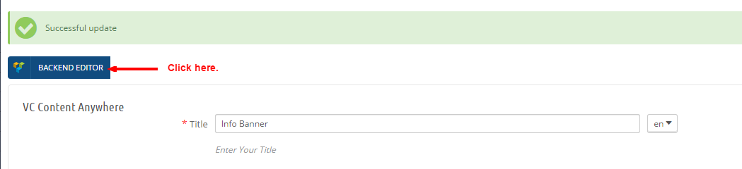
You will get the follwing image. Click the (+) plus sign to add your module.
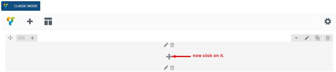
You will get all the VC elements. Find your module which you want to use by VC.
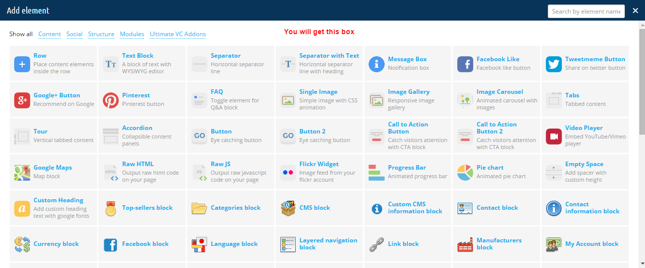
To get it easily, write the module name on search box. then seleck it.

Now Select your possition and then clcik save changes button.
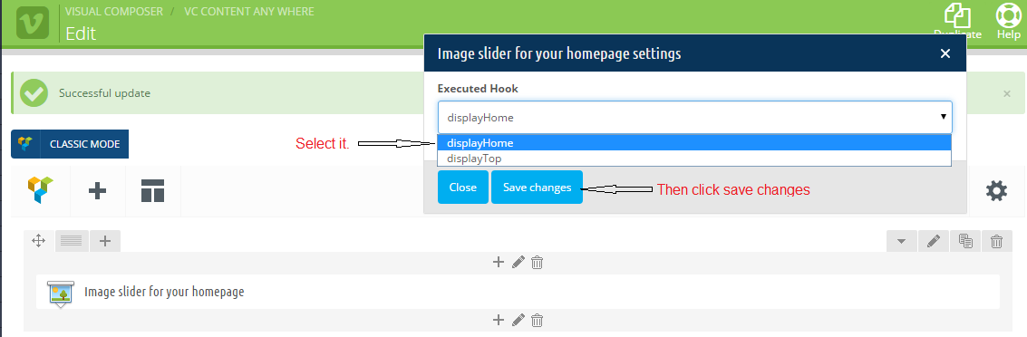
Finally You have click save and stay button.

As you are not set the module before , you won't find your module on frontend.
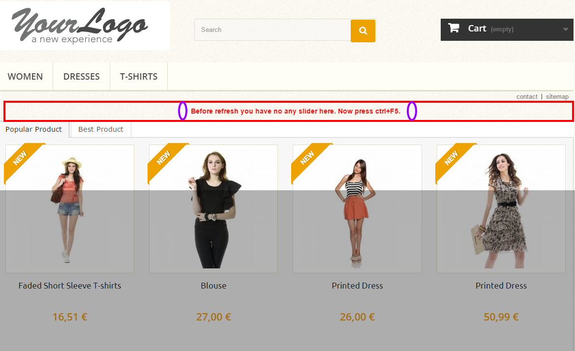
To see your module on frontend after set the module by Visual Composer, you have to refesh your site as press ctrl+F5.